The Cinematography of Ocean’s Eleven (2001)
Hands-down one of my favourite movies of all time. It has it all: a massive star-studded cast, romance, comedy, humour, cleverness, flash, fast-pace, and keeping the viewer hooked til the very end. I’m a gigantic fan of heist movies to begin with (Inside Man being another favourite), but this one takes the cake as a phenomenal showcase of talent and entertainment.
One of the biggest reasons this movie (that I’ve admittedly seen countless, countless times before) made the Cinema25 Cut was because Director Steven Soderbergh is also the Director of Photography (DP). No, this isn’t a typo. Not only did the dude direct the movie which is a mission in and of itself, he also DPed it. Pretty cool. I was curious to observe how the same person taking on both roles played into the production of the movie.
Overall, the cinematography of this movie is generally unremarkable and that’s kind of why I like it. It’ll never make a list of the Top 100 Most Beautiful Movies Ever Made. It’s funny because it’s a Vegas movie that doesn’t really feel like a Vegas movie in most ways. Instead of showing off the glitz and glamour of the strip, we spend most of our time in hotel rooms, hallways, secret gambling rooms, air ducts, and vaults.
I can’t begin to tell you how much I love this movie, simply because it’s fun. Here’s everything I learned about cinematography from rewatching Ocean’s Eleven.
Some of these observations will be chronologically or thematically random, but hopefully the observation itself is of enough value to trump the fact that this isn't an analysis worthy of a University English paper.
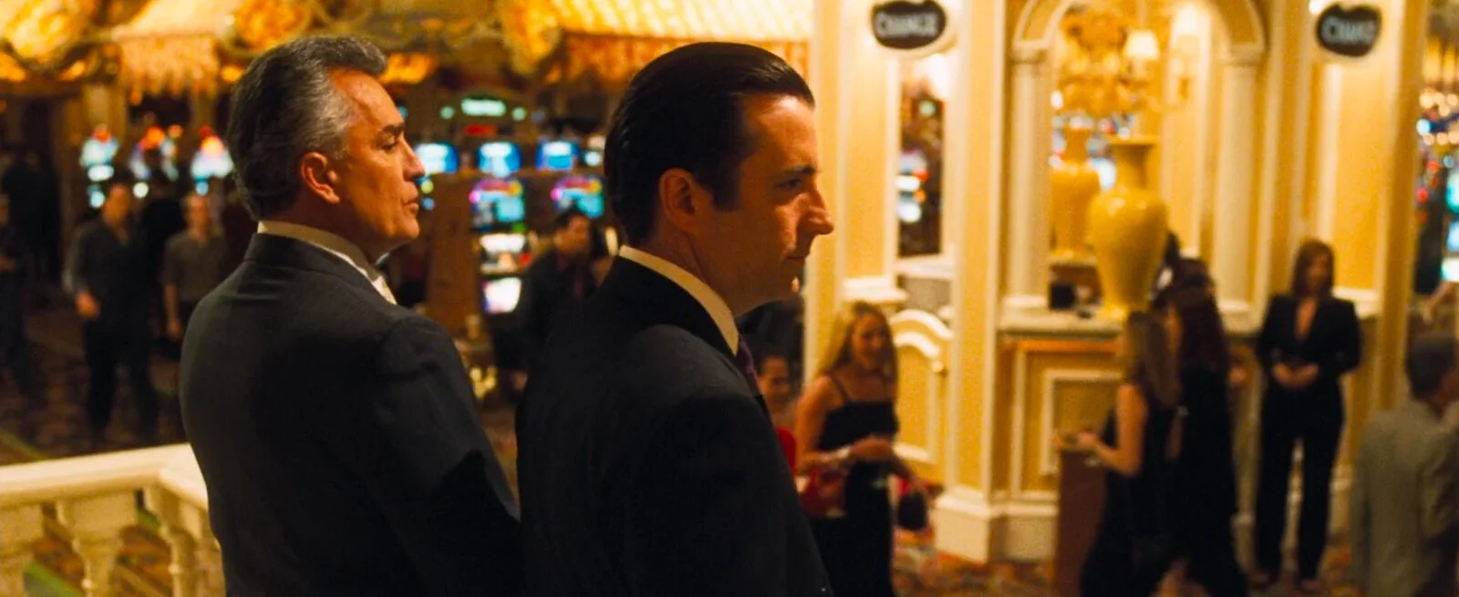
1. Soderbergh says in interviews that he specifically wanted Ocean's Eleven to feel unlit. Every light (Generally speaking) in the scene he wanted to be motivated and not overly glitzy or glamorous. This is especially apparent anytime someone is on the casino floor. Everything is washed in super warm lighting and rarely do we see something like a strong key light or sharp edge light.
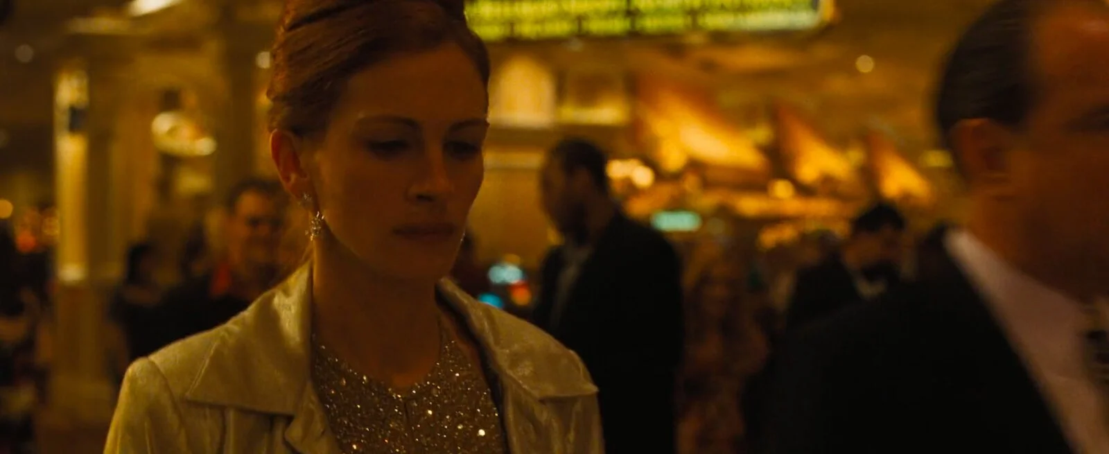
Tess walking through the casino in a very (clearly) “unlit” format. Soderbergh also claims this was one of his favourite scenes
2. An unlit film also generally goes in the face of traditional Vegas movies, which showcase the neon and highroller lifestyle of the city. By not making the film feel too polished or Hollywood perfect, the tone of the film is set in a different direction.
3. Throughout the movie we see Soderbergh not nervous about using long takes that are between 60 and 90 seconds long with relatively little to no camera movement whatsoever. These scenes, again, aren't overly flashy and don't draw attention to themselves. The scene in Reuben's backyard relies instead on blocking and framing to keep the shot feeling dynamic and interesting.
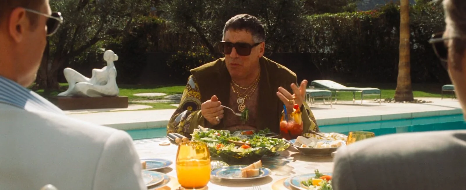
4. While Soderbergh didn't want a traditional Vegas aesthetic, he wasn't nervous to use colour. In many different instances in the movie, actors are bathed in completely over the top, contrasty, saturated colours. Often there's a touch of neutral daylight-balanced lighting to keep things down to earth, but never if it isn't motivated.
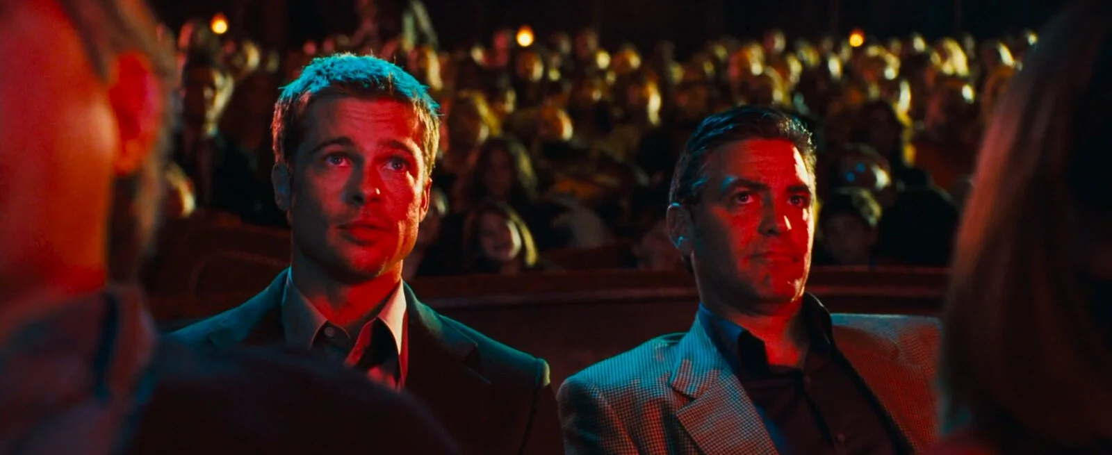
Rusty and Danny scoping out Yen at the circus show. Bathed in contrasty lighting
5. Soderbergh isn't a massive fan of scene setters: quick clips of new locations that show the audience where we are. Instead, Soderbergh prefers to use alternative film or audio techniques to get this point across. A lot of the time audio from the next scene will start before the camera has cut over to it. Or other times we'll have a conversation take place completely off camera to set the tone in one way while the camera does in another.
6. One of the other ways Soderbergh gets around using scene setters is by shooting relatively wide. The scene in Reuben's living room where the heist plan is being explained to the crew for the first time was shot entirely on a 27mm lens. Because the film is in a cinemascope 2.35:1 aspect ratio, a lot of the sides of the frame are open enough to convey a location without needing to waste time with a scene setter.
Saul during the team’s briefing in Reuben’s living room
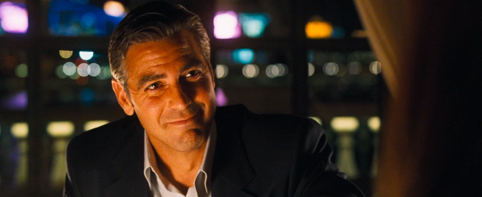
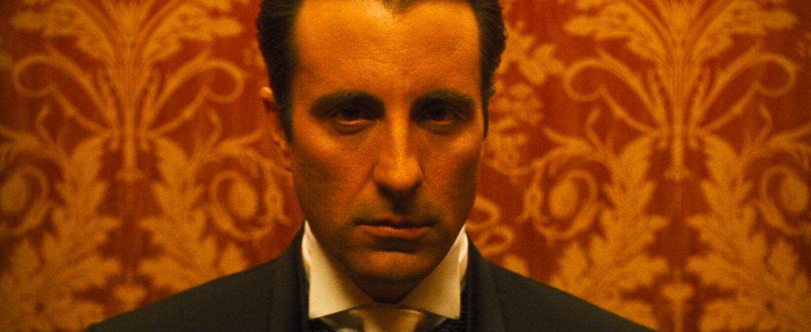
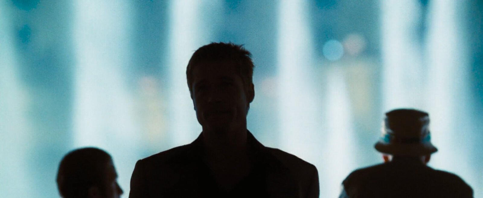
7. This movie has a ton of characters lit from below (there’s gotta be a technical term for this that I don’t know and can’t find on Google) with catchlights also sitting low in their eyes. This lighting style is traditionally saved for scenes where the character is meant to be foreboding (think of telling ghost stories around a campfire with a flashlight under your face), but in this movie it’s just a natural part of many scenes. I really dig it. It’s not in-your-face, and it’s often balanced out by a hairlight from above, so the character still pops off the background a little.
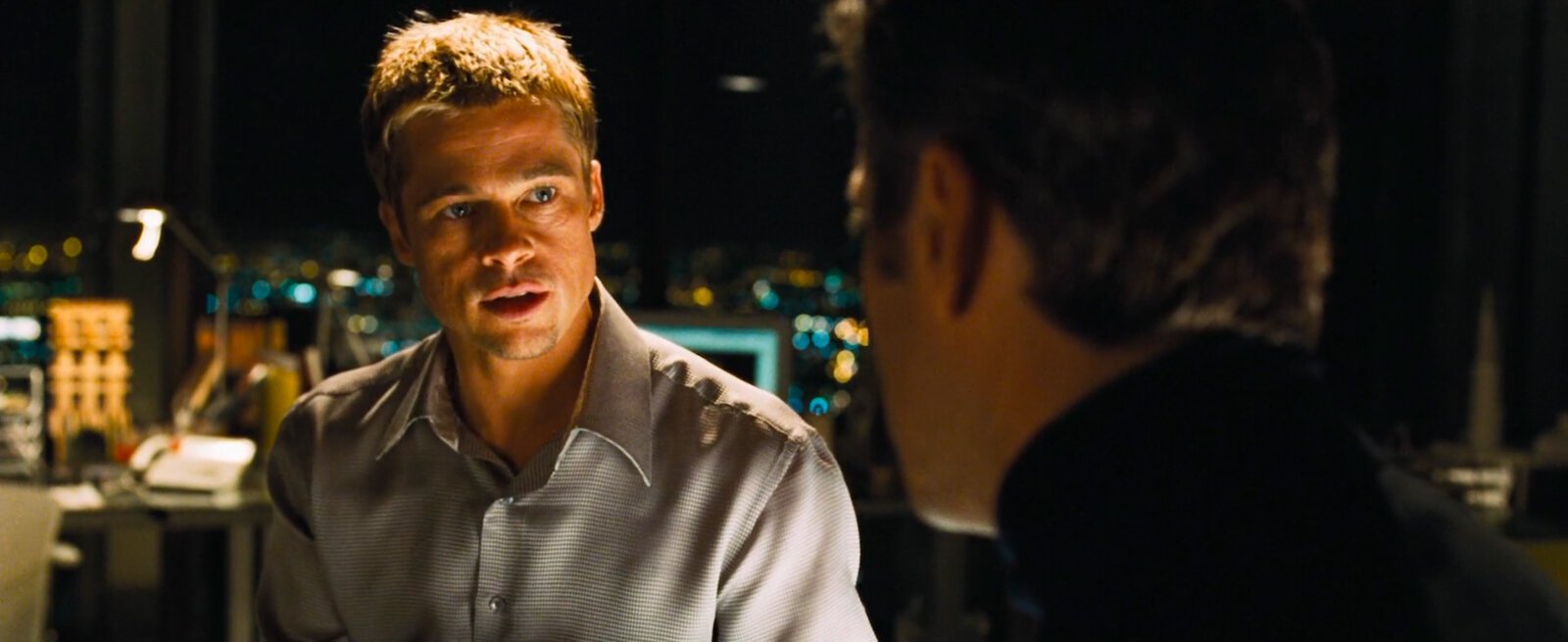
One of a few places we see characters being lit from below
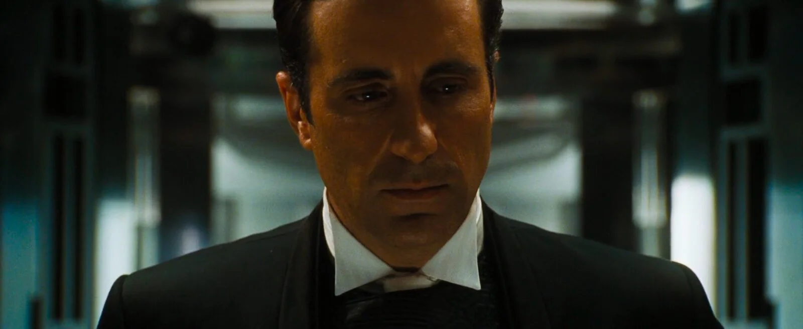
The only time we see this technique used to make a character menacing

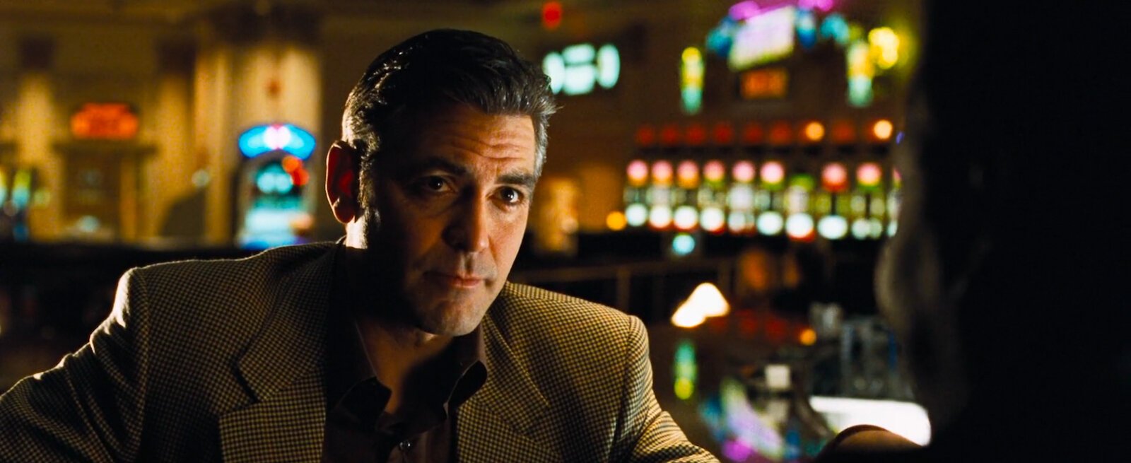
A character in the bar means they’re being lit from below
8. There’s quite a few centre-weighted shots, but they aren’t hit-you-over-the-head symmetrical like a Wes Anderson flick. They’re used as often as they need to be, but not more than that. Soderbergh has no problem keeping the frame unbalanced throughout the rest of the film.
A common composition with two characters (often but not always Rusty and Danny) on either side of the frame with another character between
This time it’s Danny in the middle with the two bodyguards on the sides
9. Traditionally, zooming in on something (especially with fairly harsh and abrupt zooms) is super cheesy. It’s something people just don’t do some 20 years later in filmmaking. If we see a zoom in modern cinema, it’s usually more of a slow push-in to create emphasis than a straight-up zoom in on a detail. Ocean’s Eleven isn’t like that, though. This movie has zooms all over the the place, often connected with pans back and forth from one subject to another. Again, this is really something you never see anymore, but in this movie it happens so often that you kind of forget about it. Soderbergh uses these to create his own Ocean’s Eleven cinematic language, and I think it works really well.
This scene (which starts here and ends below) is a push and not a zoom, but the point remains
10. Besides the few long-takes I mentioned above, Ocean’s Eleven contains a lot of shorter “oners” (I put that in quotes because it’s not really a oner) that are anywhere from 3-5 different compositions in the same clip, with pans and zooms in between. Keeping these pans in, even when they’re fast and the set is blurred, gives the scene some room to breathe. It helps the audience understand the blocking / relativity of actors to the details also being shown in the scene. Combined with the zooms mentioned in the last observation, these things come together to really just make their own language. It’s different from most movies, and I like it a lot.
11. Building on the last point, these “long takes” with multiple compositions don’t always follow the same character or subject. Sometimes a scene would open with a Glidecam shot following someone walking and switch to tracking another person when they entered the frame. This is cool, maintains the visual language of the film with lots of pans, and also continues the practice of scene-setters that are more an actual part of the scene than just lame insert shots.
12. Expanding one more time on multiple-compositions-in-a-single-take, Soderbergh isn’t afraid to move from what would usually be an insert shot to a medium scene setter to a tight portrait, all in one take with pans in between. These differences in framing relative to the zoom and camera position add more depth to the scene. They’re super untraditional.

The Pinch
13. From a cinematography perspective, careful attention was taken to give each of the Eleven cast their own special introduction with their own unique camera trick or tactic. You’d have to watch to fully understand, but I’ll try to briefly give a few of the notable ones:
The introduction of Basher is almost entirely handheld with subtle camera shake
Livingston’s introduction includes zooms and pans that would be similar to his surveillance cameras
Linus’s introduction is shot in 12 frames per second with occasional freeze frames
Saul’s introduction is very slow with long takes
All of these cinematic styles are subtle and reflective of their characters / individual personalities. It’s a really subtle thing to do but a cool way to use cinematography to further illustrate different locations around the country and the different members of the cast.

Basher’s introduction during a heist of his own

Linus’ introduction in Chicago
14. The camera has a voice - this is fundamental cinematography knowledge. How a DP controls its movement, zoom, exposure, pacing, height, framing; all of these things affect how cohesive a scene or film feels. Often times Soderbergh matches up a left-to-right dolly movement between two different locations to make the transition smoother. Sometimes a clip will start slowly pushing in and a cut to another angle will continue that push in and stop. This cohesiveness really keeps things smooth and makes it feel intentional. This is good filmmaking.
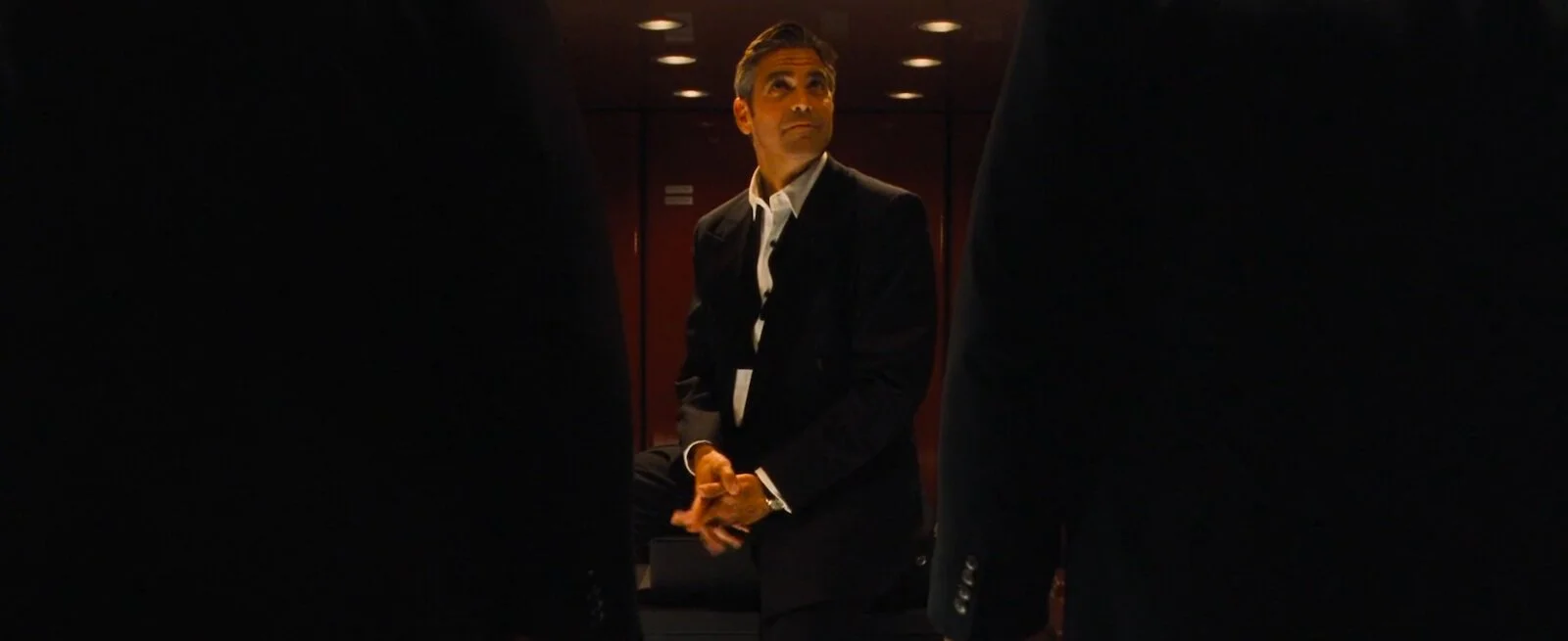
15. However, opposed to my last point, sometimes this is just entirely by mistake and we mustn’t read too far into a DP’s thought process on set. A lot of the time, we’re just problem-solving. In an interview, Soderbergh explains how, near the end of the film when Terry is in the elevator and the doors close, it cuts to black and re-emerges on a black scene in a different location of the Oceans warehouse. He said this seems super intentional but was a total fluke and just worked out. A prime example of winging it and sometimes just getting lucky with how something comes together.
16. The Clair de Lune scene at the end of the film is one of my favourites. Silhouettes against the iconic Bellagio fountain (never mind the joke of going back to the casino you literally just robbed of $160 million lol) is just phenomenal. There’s no single frame I love the most, but the whole thing is just dreamy and a nice change of pace from all the stress of the heist.
17. Soderbergh has explained in interviews that the reason he DP’d and directed the film was because he wanted to have a more intimate connection with the actors when filming. Though he has an appreciation and background doing cinematography, he openly admits he is far from the world’s best, and that they easily could’ve found someone better than him to do the movie. That being said, I now love that he did it. I think he created this super fascinating set of rules and practices that make the film super unique and unlike other movies. I particularly love that it’s not super flashy because it keeps the emphasis on the story.
Until I sat down to analyze this movie’s cinematography, I would’ve always just told you I liked the story, and I liked how the movie made me feel. I couldn’t point to specifics like “I love the colour palette” or “I like the funky camera movements” or “the bokeh is delicious”. I just loved the movie as a whole, and I think that’s one really important take-away here.
As a cinematographically-minded person, my first question when I’m filming something is, “How can I make this scene more beautiful?”, but Ocean’s Eleven is a reminder that the first question should be, “How can I make this scene better tell the story of the whole film?”
No shame here. Ocean’s Eleven remains one of my favourite movies of all time. #1 spot on my list of “Most Rewatchable Movies Ever”.
At a Glance: My Personal Takeaways for Future Filmmaking
Analyzing a movie like this is a waste of time if I don’t take something (or a long list of somethings) from each film and apply it to my filmmaking going forward. Here are my key takeaways from Ocean’s Eleven:
1. Filming a scene in a way that communicates the tone of the overall film is better than trying to make every frame worthy of hanging in a museum
2. Pans between compositions aren’t a waste if utilized properly
3. You can use unconventional techniques to create your own visual language for each film. In this instance, they were pans, zooms, and transitions that are traditionally thought of as cheesy
4. Don’t be afraid to make things feel unlit and natural. Ugly light can look like ugly light
5. Be more meticulous when shooting to combine multiple shorter cuts into a single mini-oner where appropriate
6. Not every film needs to be the same as the last one. Not every film needs to be different from the last one
7. Consider ways you can differentiate characters, locations, and themes using cinematic techniques such as framing, time of day, colour palette, frame rate, camera movement, and any other tool at your disposal
8. If a subject you’re shooting has a traditional approach that most filmmakers take, stray to set a different tone
9. Balanced doesn’t always mean symmetrical. Symmetrical doesn’t always mean balanced
10. Unconventional lighting doesn’t always need to be so over-the-top that it attracts attention to itself